1984: Typeface and Cover Design

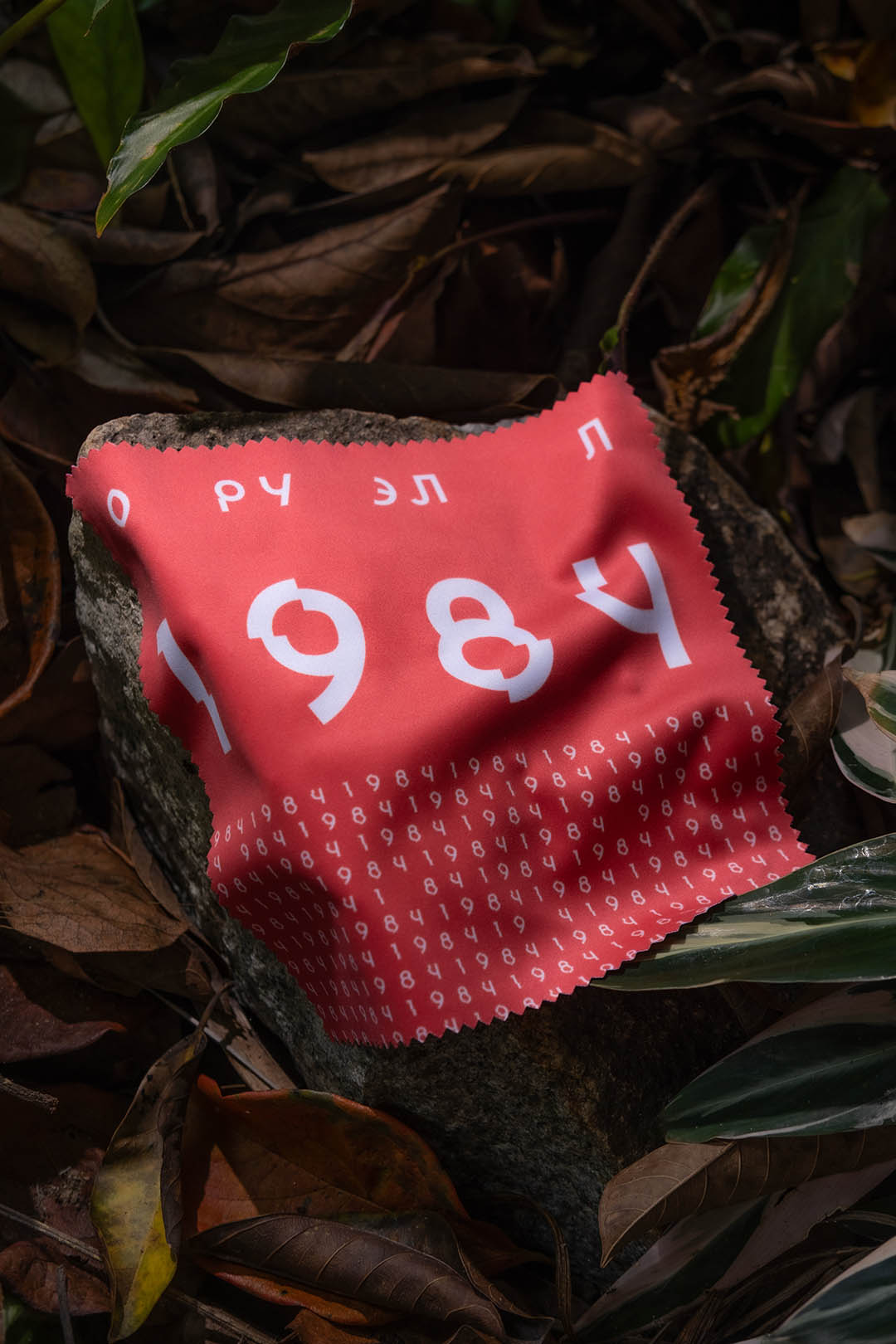
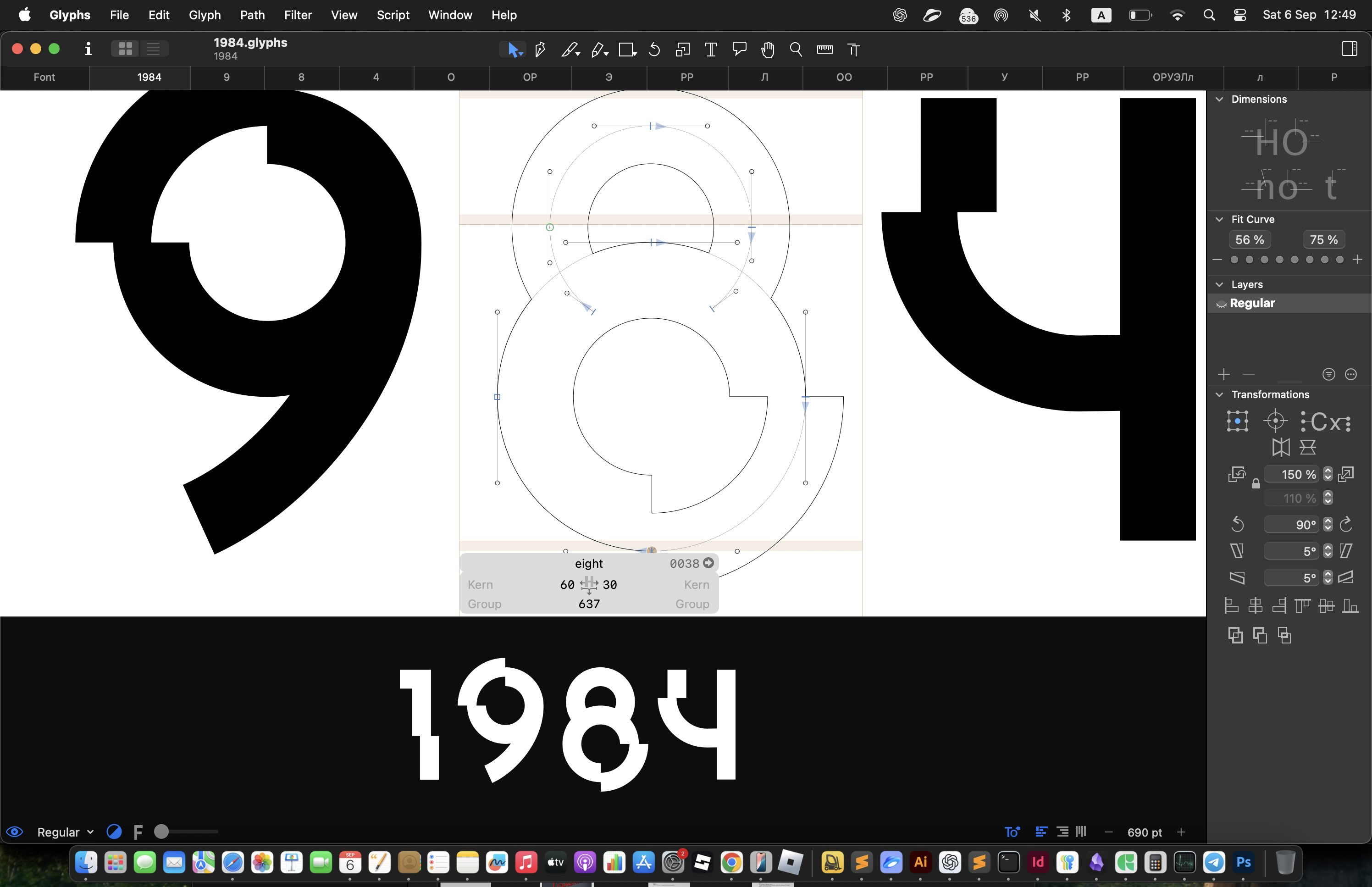
The “O” is designed as an eye. The other letters continue the theme of geometry and constructivism established in the early 20th century. But unlike the style of my previous cover for the novel “We”, this refers to the late 1940s — early 1950s. The typeface here is very much a product of its time.
At the bottom I created a typographic pattern composed of the digits from the book’s title. It references both punch card design and computer code in general.

The slogan and one of the key quotes of the book is “Big Brother is watching you”. The theme of surveillance is reflected directly in the design of this cover. The circular elements in the “1984” lettering resemble camera lenses.
This connects to technology, and the typography reflects this as well. First of all, the forms are pure geometry — no serifs, no classical references.
Instead there is a minimal glitch. It is not just a visual trick — it reinforces the ideas of the book: distortion of meaning and erasure of older cultural codes.