Caspian Delicacies — Logo & Brand Identity
Concept: “À la russe”
This is Tsarist Russia — detached from a specific era — a fantasy variation on Rus built from archetypal images. Sources of inspiration include Diaghilev’s stage designs, Russian painters, and the reinterpretation of à la russe by major fashion houses.
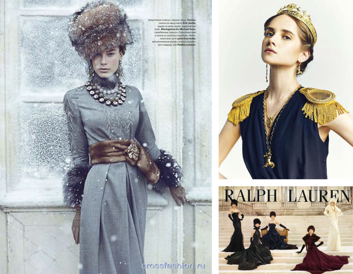
The main goal of historical references and stylization is to create an impression, not to tell a specific story. It’s important to draw the viewer into the game — for that, any era must be stripped of sharpness and negativity and turned into a fairy tale. The key is to keep the balance between ‘historical’ and ‘mythic’. The further the era, the easier it is. The USSR is too recent for overly free treatment, but Tsarist Russia is fair game. In this approach, it’s important to avoid images and plots that would de-virtualize the space — dates, concrete events, and so on. Like, for example, the fictional Nazis in Indiana Jones and Wolfenstein, the completely abstract tsars in Russian fairy tales, or Victorian England in steampunk works.
Logo variations


Patterns

Typography

Cut a slice of bread, spread it with butter, place the caviar in a mound and eat without delay